Branding & visual identity project for a Cambridge-based athletic and performance clinic
The Light Blue Clinic is Cambridge-based Injury and Performace clinic providing services to companies, universities, student-athletes, and the general public. I was tasked with re-branding their existing clinic, as well as helping introduce a new clinic that provides cryotherapy treatments to current and new clients
Challenge:
Create an identity that keeps the clinic close to its main clients Cambridge University and its student-athletes, while also giving the clinic its own distinct voice and visual language;
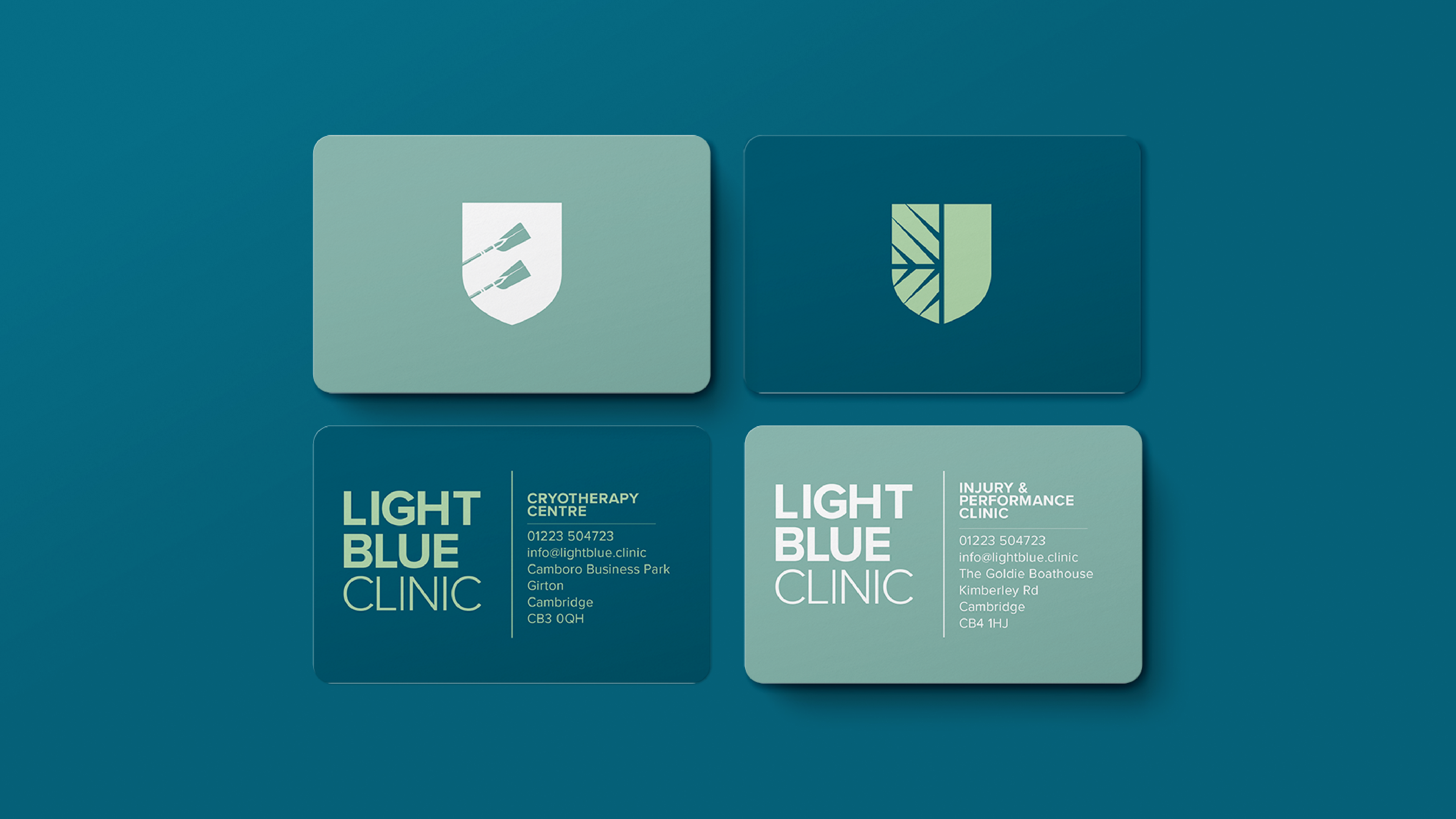
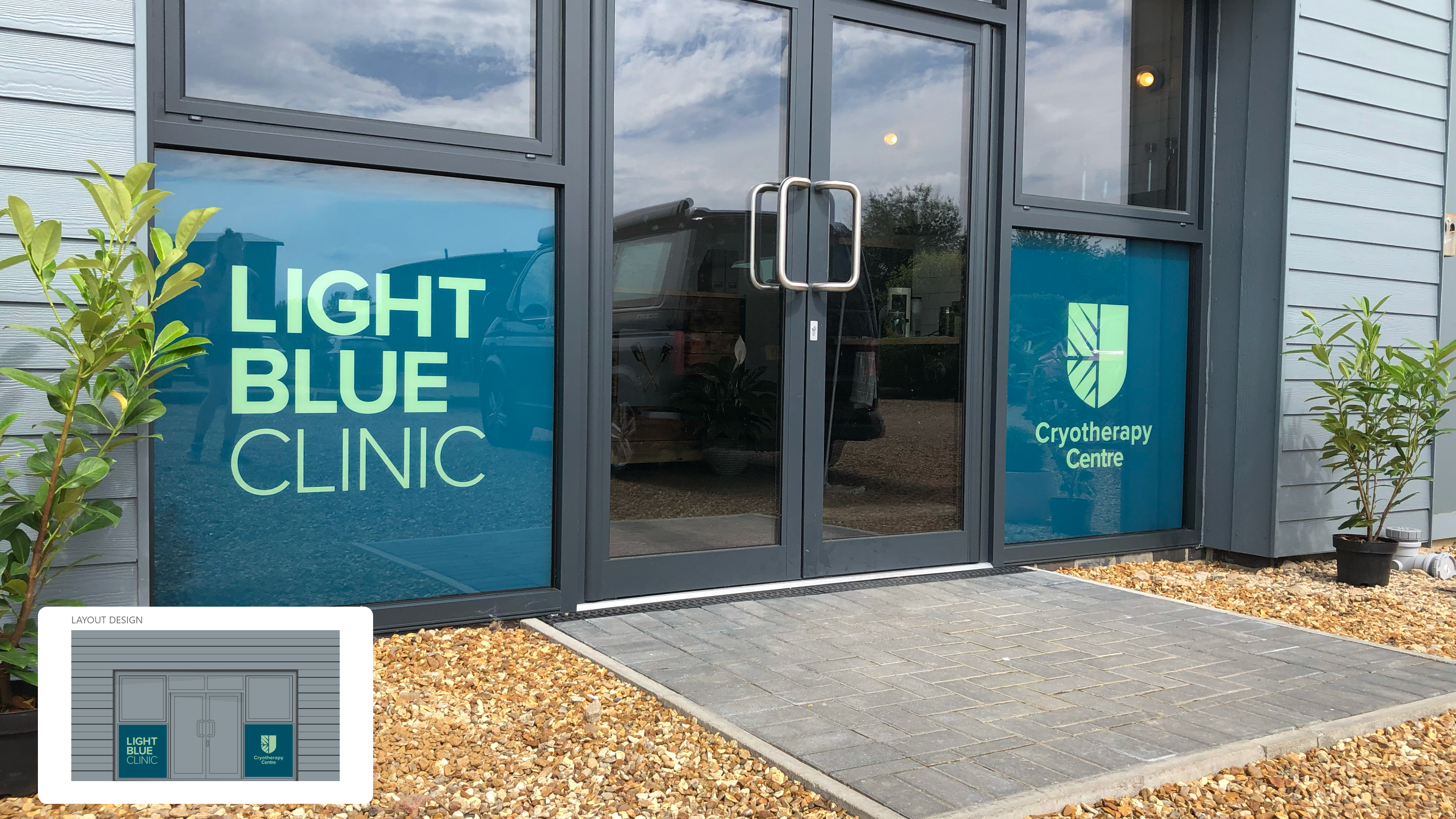
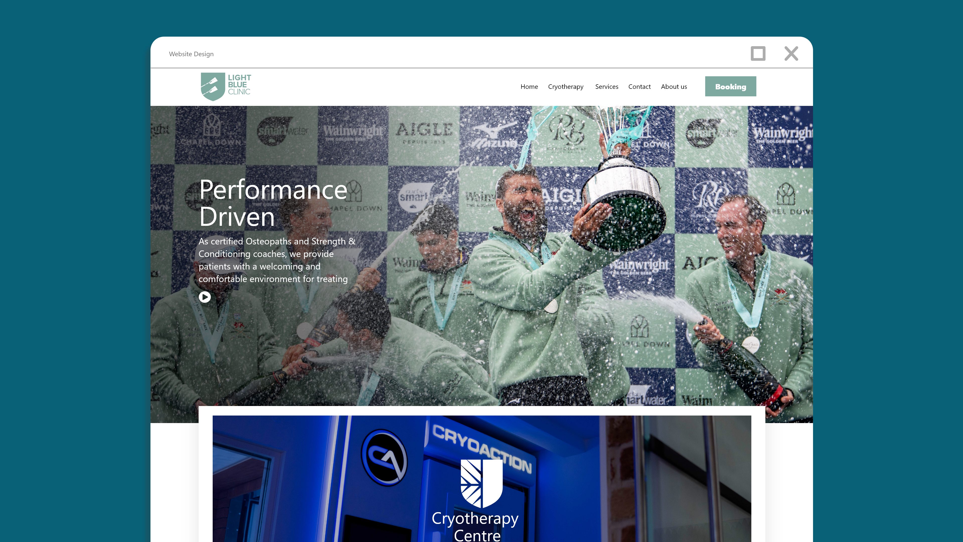
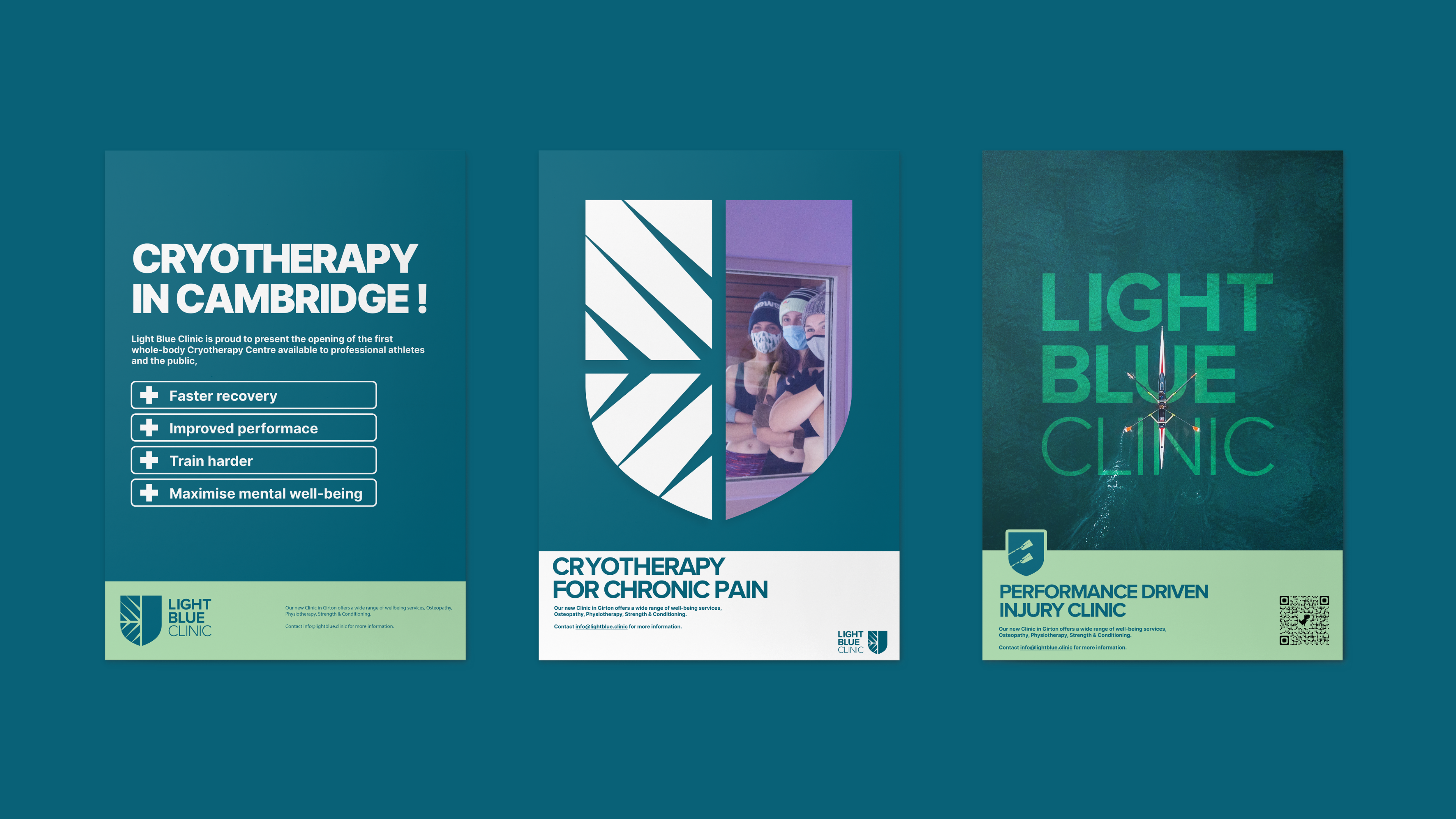
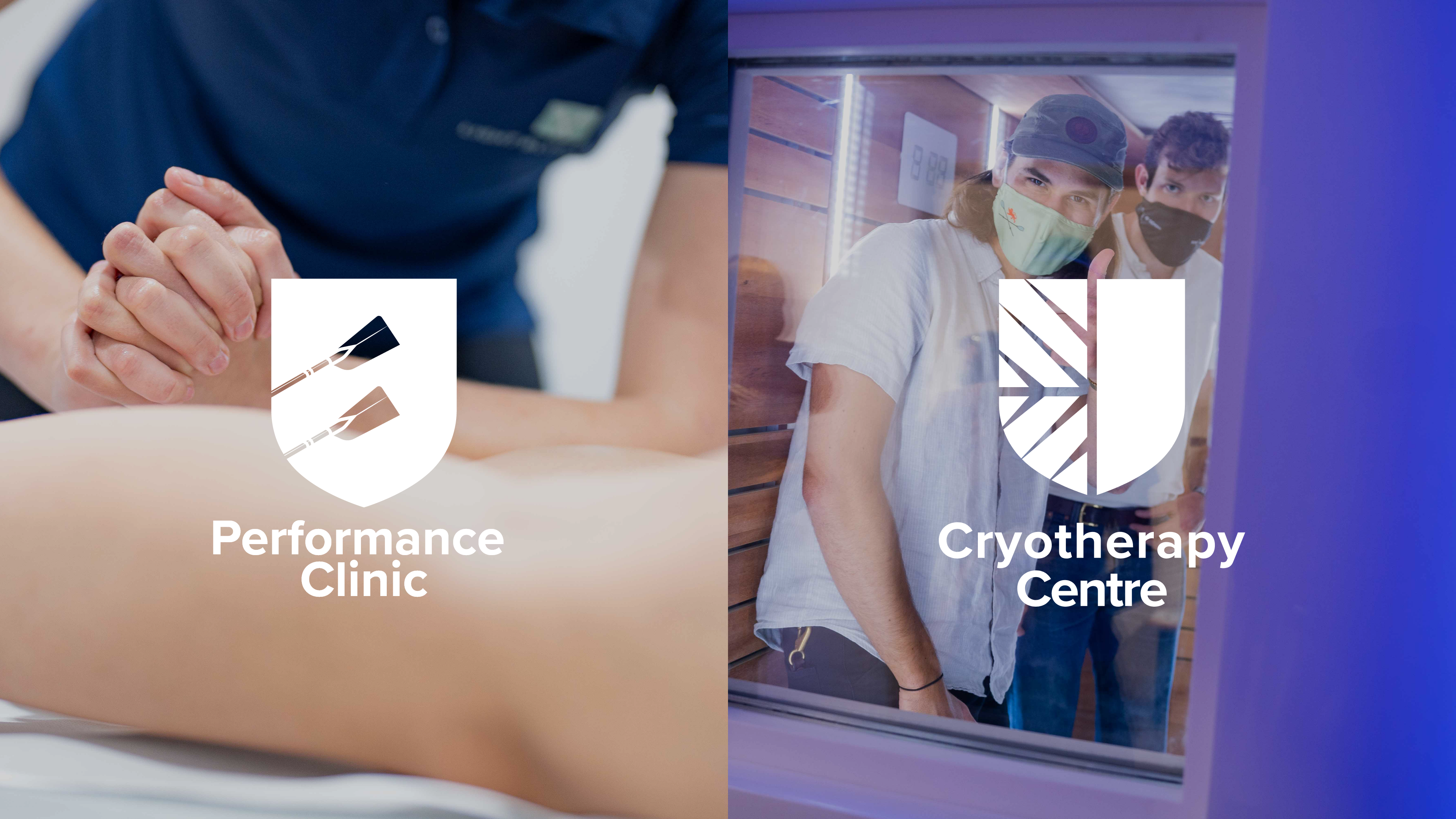
While their current clinic is focused on providing services for athletes, recovery and performance training, the new clinic will focus on the new cryotherapy treatment, so it was important to make a distinction between the two clinics while also making it clear that they are connected and run by the same business.
Solution:
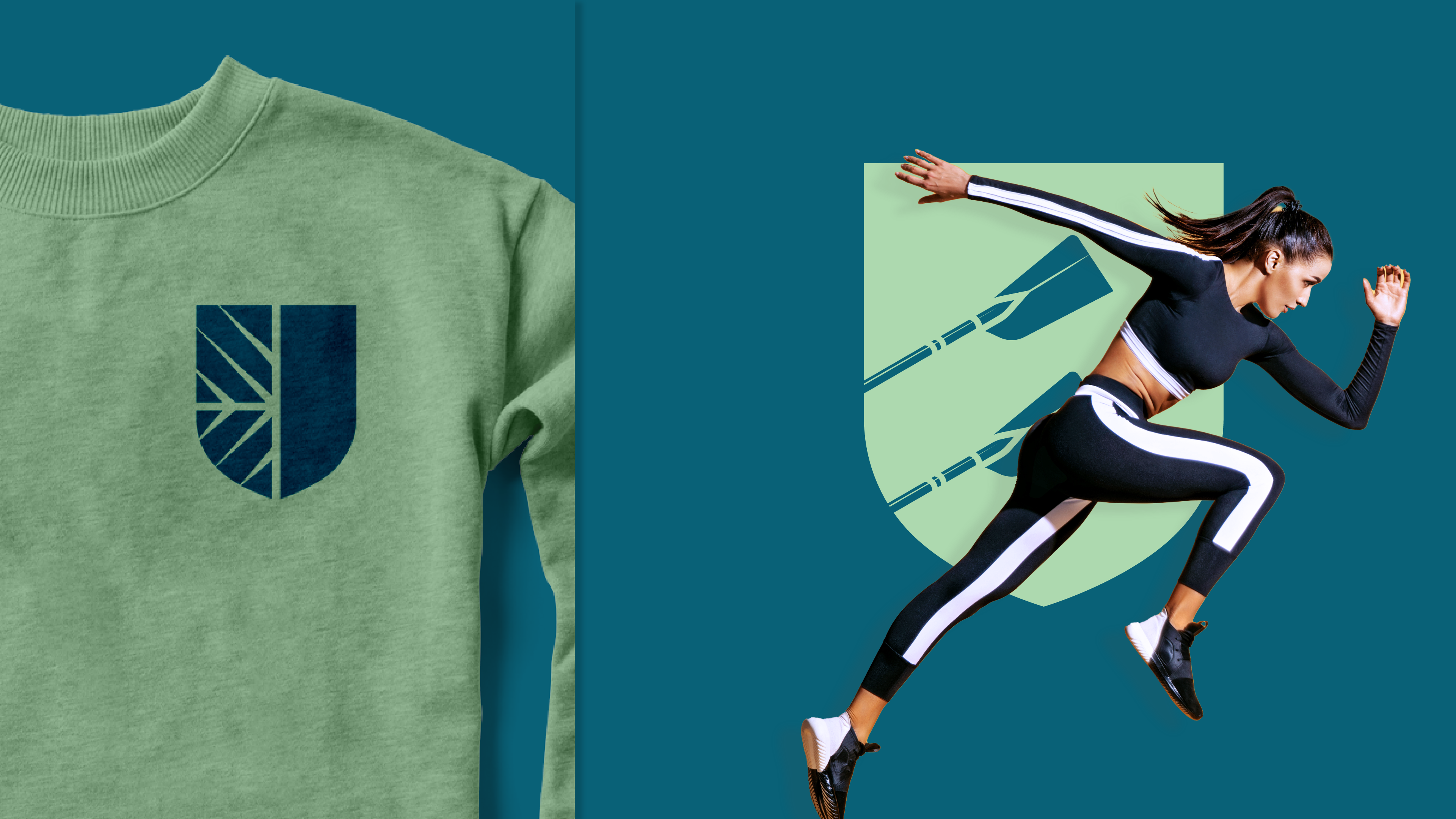
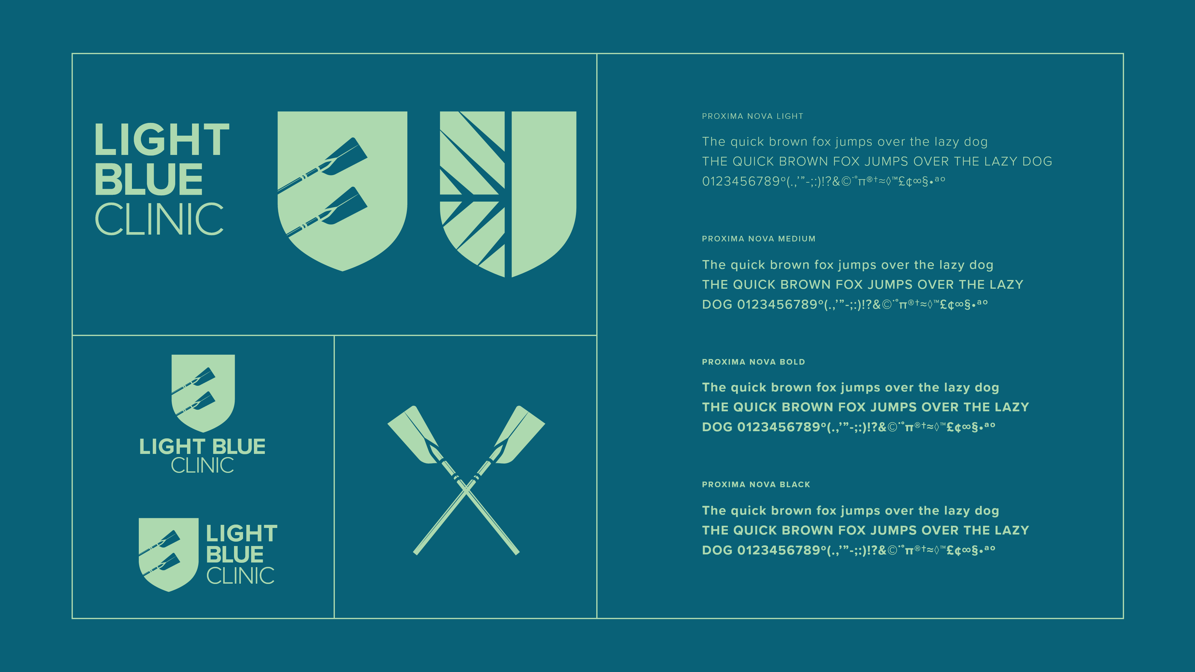
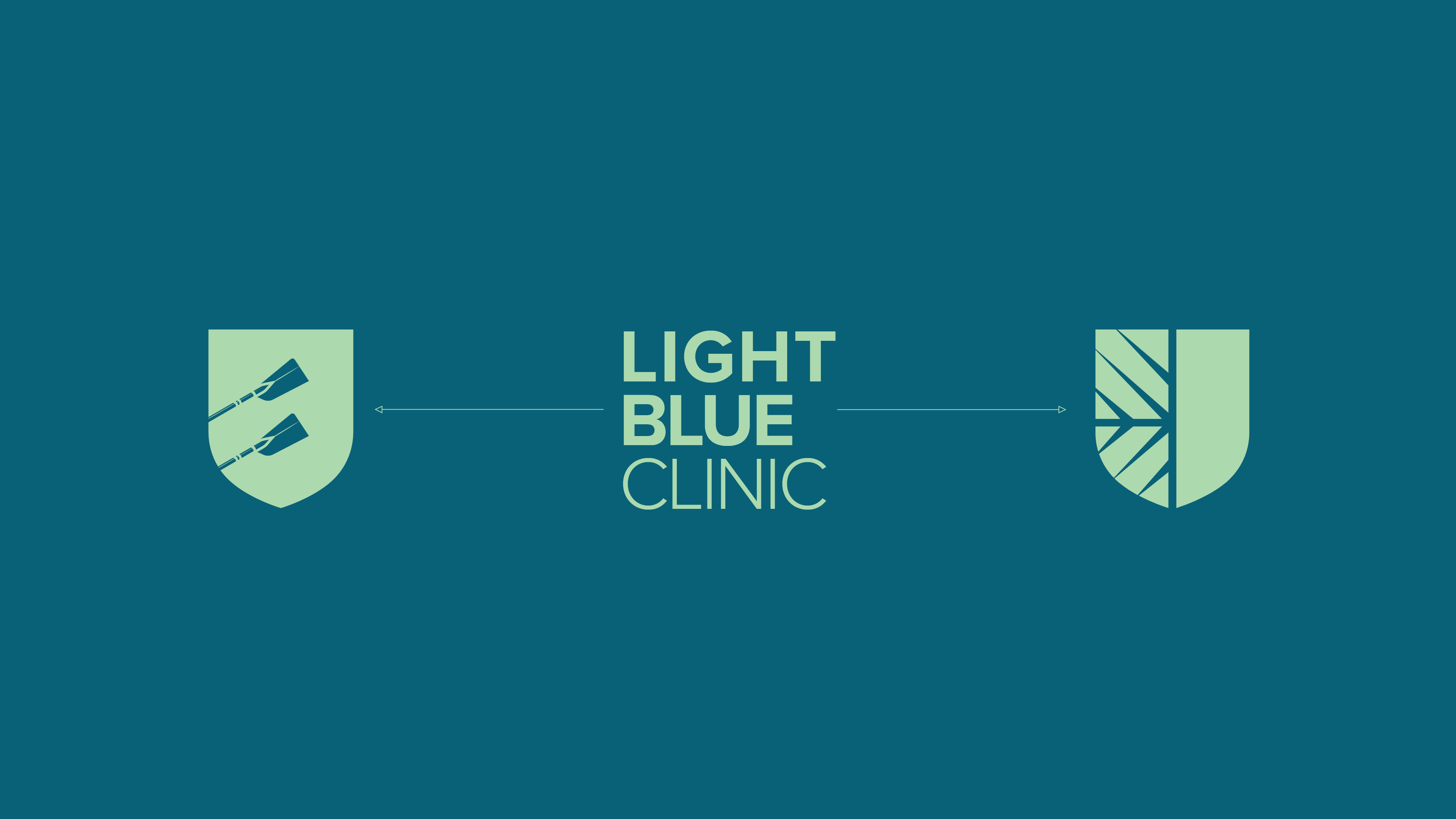
To keep the Light Blue Clinic to their student and university roots, the main crest-style design and the colours of the brand were chosen to bear similarity to the Cambridge Varsity and the student groups, especially the Cambridge University rowing team, who are a main client for the clinic;
In order to make a visual distinction between the two clinics, I created a type design alongside two logo symbols for each clinic so that they can be interchanged and used appropriately while still feeling like they are part of the same brand;